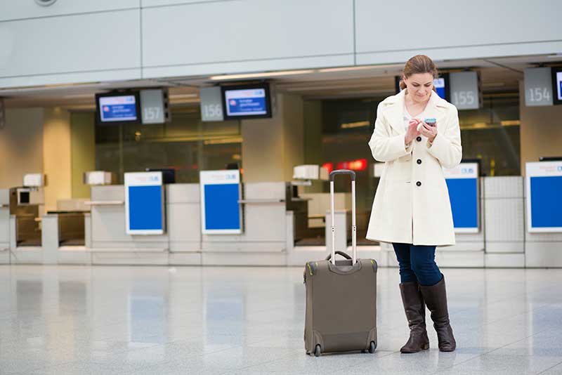
It’s easy to forget how much preparation is needed before we embark on a trip. A journey from the hotel to the airport can sometimes be as time consuming as the flight itself. When travellers are uncertain about something they will turn to the website of their departure and arrival airports for help. Here lies the opportunity for airports to not only reduce stress for travellers (which can be bad for spending), but create an enjoyable experience for passengers before, during and after their visit to the terminal.
Let’s take a look at the features every great airport website needs.
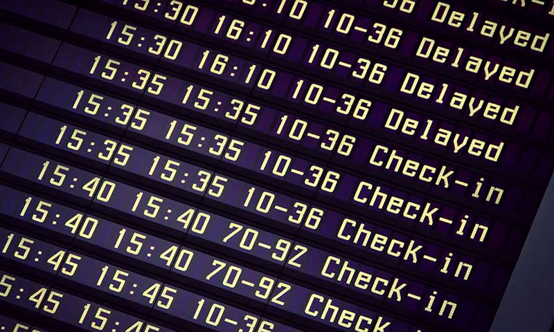
Accurate flight data

Above all else, passengers need and want accurate and up-to-date information about flights arriving and departing from the airport.
Depending on how many flights make their way in and out each day, it’s important that customers are able to search and browse the data in multiple ways. Some customers will know their flight number, others will only know it’s a flight from London landing after 10PM, so allowing them to sort and filter will help them find the correct flight.
What can be frustrating for travellers is when the information on the website doesn’t match the information on the displays throughout the terminal, so make sure the information is synchronised.
Guidance and assurance
Airports are big and people get lost. Even small terminals create a sense of uncertainty for new travellers: “What’s behind security?” “Are these the last toilets before I reach the gate?”
Great airport maps help customers understand how long it takes to get from point A to be point B. In other words, how long can I spend browsing the scotch in Duty Free before I need to make my way to gate 88?
And while any terminal map is better than no map, the more detailed (or better yet interactive) your maps are, the better chance you’ll be able direct customers in the direction they need to be and when they need to be there.
Mobile friendly

It’s no surprise that mobile traffic makes up a massive portion of airport website visits. Is your airport website friendly to view on smartphones and tablets? Every person travelling through your terminal will have one soon and they will expect to use it while there.
Multilingual
Perhaps more than other industry, airports cater for people of all different backgrounds and ethnicities on a daily basis. Make sure your website speaks to them, especially those that make up your largest passenger traffic. It doesn’t have to be a page-by-page match of your main website, just key information.
Transport and connections

Help travellers decide what the best option is for them to get to and from the terminal. Think of common questions or concerns travellers have in your city. Does your website answer what is the best way to the terminal at 4am? I’m sure many travellers want to know.
Self-service
Help customers prepare as much as they can as far in advance as possible. Let them pre-book parking from your website and or organise a transfer to their hotel. For services you don’t offer, point them to websites where they can buy or organise them.
Choices
Do you provide website visitors with enough information to compare food and shopping options available in the terminal? A business traveller will have different needs to those travelling with children, so make sure you use your website as an opportunity to showcase options. A great airport website helps travellers plan where they’ll eat and what products they’ll buy before they even arrive.
The basics
Last but not least, let’s not forget to answer the basic questions. Not everyone is a frequent flyer and those new to your airport need answers. Does your website let customers know if they can take 500mls of milk formula for a child through security? Or whether umbrellas are allowed in carry on?
It goes without saying that high quality web design, information architecture and accessibility are equally as important as the features above. A combination of all will leave customers feeling satisfied instead of angry when they visit your website and terminal. The website itself really has the power to give travellers a sigh of relief after making their experience as quick and easy as possible. If you assessed your airport’s website, how many of the above get the tick?
What do you think are the critical features of an airport website?
